Time to begin a little series of Hahnemühle watercolor paper tests. Hahnemühle offers a test pack of their watercolor papers with one A4 sheet of each. This is the base I use for these little quick reviews and first impressions.
Today I’m testing their The Collection Watercolour paper with 300gsm weight.
Chapters
- How I Test The Papers
- A List of My Supplies
- About Hahnemühle The Collection Watercolour Paper
- What I Observed
- My Final Thoughts
- Footnotes
How I Test The Papers
Every sheet will be cut down to 4 A6 sized papers for maximum testing.1 Each will be painted with a painting or sketch that will include several techniques to observe the behavior of the paper. While I do that, I have a list of criteria I want to observe to rate the paper accordingly.
For proper testing I used watercolors from different brands too, as they behave differently and are good bases for comparison. To see if the paper is also suitable to bind your own sketchbooks, which I often do myself, I painted one of the pieces on the backside. Painting the backside will show possible inconsistencies in sizing.
The paints I will use are Schmincke Horadam watercolors, Golden QoR watercolors and Lukas 1862 Aquarell. Schmincke is a great and solid brand of watercolors, QoR has many beautiful transparent colors with nice dispersion. Lukas is a brand, that has many colors with beautiful granulation and feel very down to earth. They’re also easier to control than the other two brands.
I use all of these on a daily basis and know how the colors are supposed to look. So it’s a good measurement for new papers to use the paints I know well to test the paper, which I want to get to know better.
A List of My Supplies
- Hahnemühle Watercolour Selection on amazon
- Schmincke Horadam watercolors on amazon
- Lukas 1862 Aquarell on amazon
- Golden QoR watercolors (High Chroma) on amazon
- Derwent Inktense pencils on amazon 2
Affiliate links to amazon.de were used where possible to help support the site and database. I will receive a small commission when these are used for purchases at no extra cost to you. Thank you!
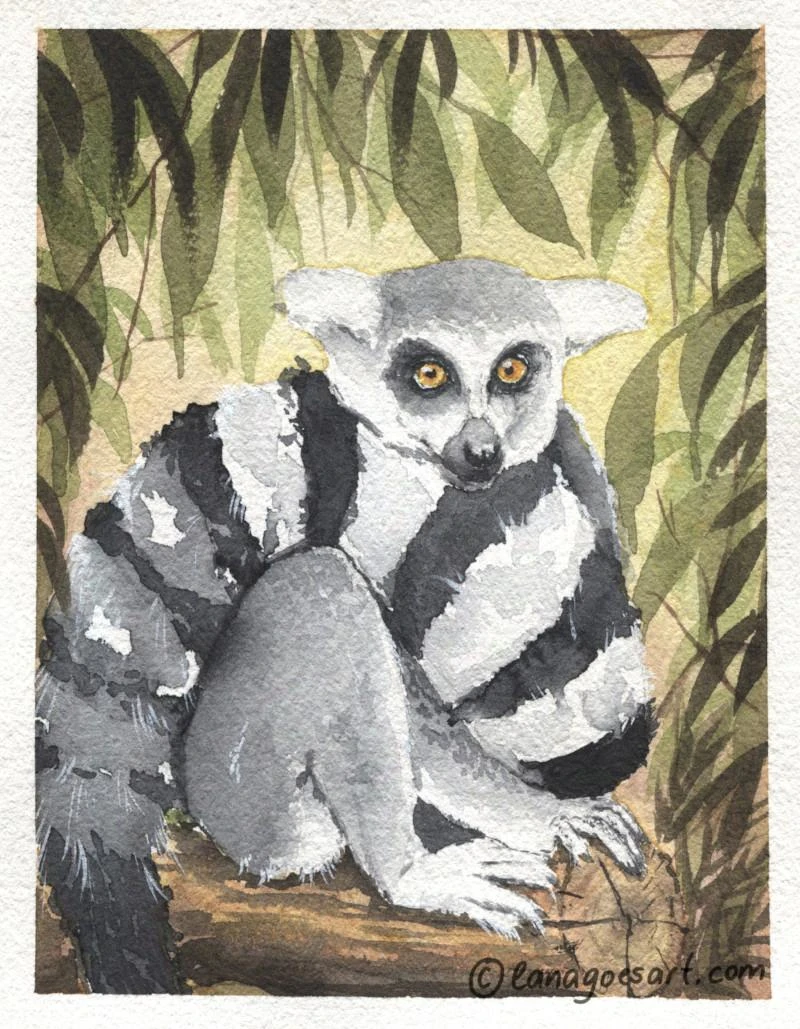
1. test painting: Lemur painted with Schmincke Horadam watercolors on The Collection Watercolour paper by Hahnemühle.
About Hahnemühle The Collection Watercolour Paper
When holding the paper for the first time, I already had a good feeling about it. The texture is a nice subtle cold press. It’s nice and isn’t flimsy. Just the perfect weight for multiple occasions. That is when I knew that this paper wouldn’t buckle too much. It needed to be tested of course.
It’s 300gsm (there is another version of 640gsm available, which will be tested next), made 100% of cotton rag and is available in cold pressed, hot pressed and rough. This test refers only to the cold pressed version of the Collection Watercolour paper.
If you want to read more about watercolor paper and tips on how to choose the right for you, you might enjoy this article a lot.
The color of the paper itself is a nice natural white, leaning slightly towards warmer hues, but still very neutral to the eye. It’s mould made and shows an irregular texture, which is very appealing to me. It’s also surface sized and vegan.3
The sizes available are:
| Blocks | Sheets | Rolls |
|---|---|---|
| 24x32cm | 56x76cm | 1,25x10m |
| 30x40cm | 106x78cm | |
| 36x48cm |
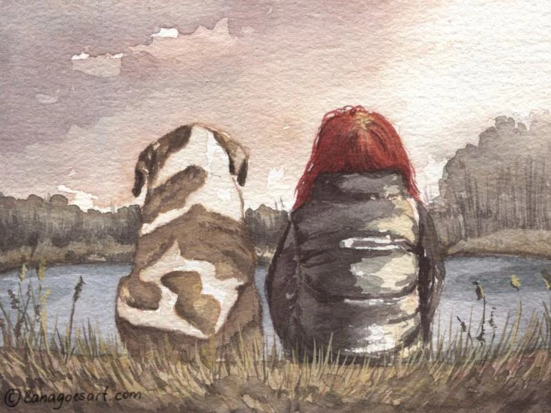
2. test painting: Best Buddies. Painted with Schmincke Horadam watercolors on the backside of The Collection Watercolour paper by Hahnemühle.
What I Observed
When painting I made a list of criteria, which I rated with stars from 1 to 5. Here is the list of all the criteria and the star rating.
| Criteria | Rating | Notes |
|---|---|---|
| haptics/feel | 4/5 | Feels ok. |
| blooms/painting wet in wet | 3/5 | Lots of blooms when painting wet on wet in the Lemur painting especially. |
| buckling | 4/5 | Paper warped a little when painting wet on wet, but dried flat. |
| paint flow | 5/5 | Very enjoyable, might be influenced by warping when not taped down. |
| granulation | 5/5 | Shows granulation nicely. |
| glazing | 5/5 | Glazing worked great on both sides. |
| lifting | 4/5 | Lifting worked great, staining colors were, as expected, not as easy to lift, but correction was possible. |
| glow of the colors | 5/5 | - |
| masking tape | 5/5 | No ripping of the paper. |
| masking fluid | - | not tested |
| erasing/surface damage | 3/5 | Slight surface damage when using a hard eraser. The area was visible in a flat wash, but was covered up by other layers. |
Buckling of the Paper and Painting Wet on Wet
When I first started painting, I was curious and applied a wet wash for the Lemur painting. It was the first one to paint and I felt brave. While I painted, I did not tape it down onto a flat surface too, to see how much it will actually bend.
The painting experience itself was super nice. I like how the paper feels. The texture is not too coarse as some other papers are (which I personally struggle with), it’s enjoyable. It took the water nicely, colors had a nice flow. The slight warping formed raised areas and valleys, which collected some of the water and paint. This is something I had to fix while I painted. It also increased the creation of blooms during the drying process. They’ve been especially visible in the first layers. The following layers covered that up well though.
As the paper dried it flattened back completely. You can only see traces of where it buckled on the backside, which does not influence the look of the artwork at all.
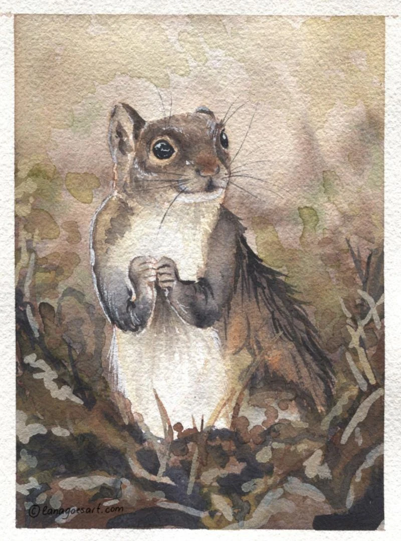
3. test painting: Curious Squirrel. Painted with Lukas 1862 Aquarell on Hahnemühle The Collection Watercolour paper.
Granulation and Glazing During the Test
Granulation looked very pretty on this paper and I enjoyed that a lot. The Curious Squirrel painting used many granulating colors by Lukas. And while I struggled with the painting, it was not the fault of the paper why I did so.
I glazed in every of the paintings to some extent. This worked wonderfully on the paper using both staining and lifting pigments. And while lifting pigments are not the best first layers and I had to be careful due to these characteristics, it worked very nicely.
Surface Damage from Erasing
By erasing I wanted to see how the paper would handle corrections during drawing. Especially inexperienced painters might erase a lot using a stronger eraser. So I tested it. After painting the first layers I saw, that erasing did indeed damage the surface a little. It was visible as a spot, which took the color differently. This spot was too covered up by the following layers. If you intend to use flat washes in your art, then using a soft kneaded eraser would be best choice on this (and probably any other) paper.
Painting on the Back of The Collection Watercolour Paper
Painting the back of this paper was actually enjoyable. It has a slightly smoother texture compared to the front side. But behaved equally well. I had no issues with it and actually enjoyed the process. You can see the result in the lovely painting of Best Buddies - a lady and her pup friend. The lovely color palette was created by using Napthol Maroon, Delft Blue and Yellow Ochre mainly with a few additional earth tones. In case you want to play with colors, this was a really nice limited palette to play with.
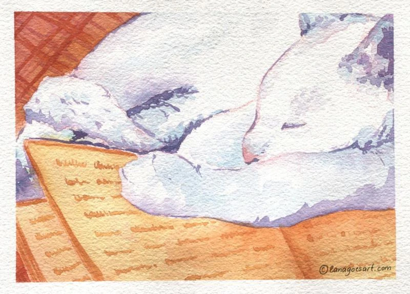
4. test painting: Cozy Book Club Kitty. This one was so much fun to paint using a Derwent Inktense pencil to sketch and then painted loosely with the High Chroma set by QoR.
My Final Thoughts
The Collection Watercolour paper by Hahnemühle as a name reads a bit weird to me and very fancy. But while painting on it, it actually showed, that this paper is a solid choice to paint on. I didn’t encounter anything, but maybe the blooms in the first painting, which threw me off and I didn’t feel like I need to adjust to this paper a lot. It performed just as I expected from a professional paper.
It’s definitely a paper I see myself using in the future… once I use up the huge stash I already own. ;) Which also means, that I will test a “few” other papers and share my experiences.
This series is meant to create reference points for artists and beginners alike to be able to choose a paper for their needs.
Have a wonderful and creative day!
Lana
Footnotes
All papers from now on will be rated by the same standards to create a comparable base and a reliable source to look up watercolor papers in the future. This will hopefully allow to make a more educated choice to purchase new papers to fit your needs without being disappointed. All papers will be compared to professional 100% cotton paper standards.
I used the Pink Flamingo pencil for the sketch of the sleeping kitty when I painted with the QoR pencils. They had a beautiful harmony and I love the effect it created.
Other paper from Hahnemühle but also many other brands use gelatin as traditional sizing.
