
There is this unspoken longing when we see mountains, right? The height, the danger but also the beauty and possibility to look down at the earth in awe. Today we’re going to paint a mountain landscape together and have a talk about perspective and distance.
Chapters
- Some Theory on Perspective and Colors
- The Reference
- A List of My Supplies
- 1. Sketch first
- 2. Paint the Sky
- 3. Give the Mountains Warmth
- 4. Paint the Shadows
- 5. Let’s Start with the Details
- 6. Paint the Central Mountain
- 7. Warm Up the Foreground
- 8. Deepen the Shadows
- 9. Adjust Values
- 10. Add Few Highlights
- Final Piece
I always loved mountains but I’m not a climber and never lived close to them. So I enjoy painting them a lot. Some of them you can see in the gallery and in previous posts too. This tutorial resulted from a number of conversations I’ve had about color theory and perspective. So there will be a chapter where I discuss the theory behind the painting. This way you can apply these techniques and knowledge to your future paintings consciously and will know how to achieve certain effects.
Of course we’ll also paint one landscape together. For those reading the blog: there is a live stream accompanying the tutorials on twitch as always, which will be edited in a video for YouTube as soon as possible.
Some Theory on Perspective and Colors
You’ve probably already heard the basics, right? Because who didn’t. Colors are lighter in the distance and also cooler. But what does it actually mean when you paint and what distance are we speaking of here?
That is actually tricky, so I’ll try to explain in short what we’ll focus in in this tutorial. It’s the recognition of distance by the choice of colors and mixes we do. In most cases that es exactly enough to actually show how far something is.
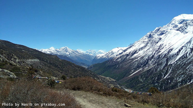
This reference is an example. You can see plenty of mountains almost overlapping and they become lighter towards the horizon. But also notice how the sky is also turning lighter the closer to horizon it is. The mountains that are furthest back have almost no contrast, show light blue in the darkest areas. The closer they come, the darker but also warmer is the tone of the darkest values of the section. Of course the foreground shows the warmest tones but also most detail like grass and stones, which are merely a texture in the middle and not visible in the back.
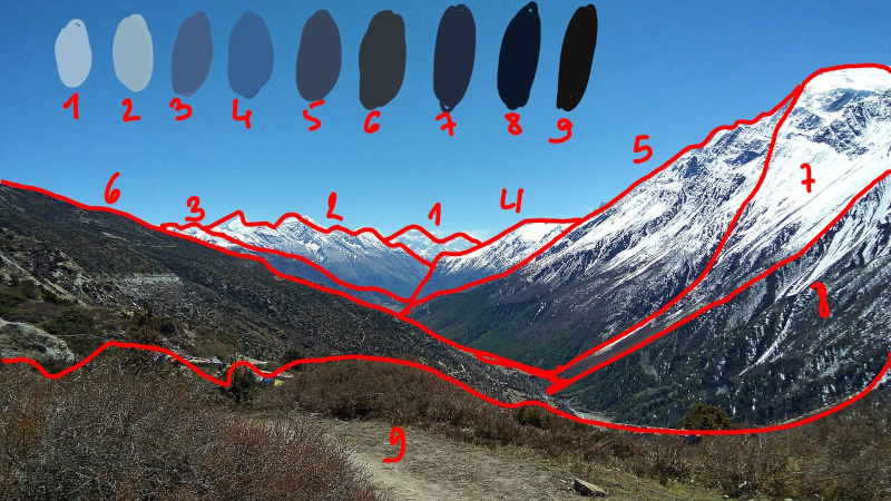
To paint this, we would need to break down the mountain area into sections. Here you can see clearer. To demonstrate the theory I used swatches from the darkest area of each section that you can see labeled with the number of each section above in the sky. Those clearly show how little color you need for the mountains in the back.
In addition I numbered the sections in the order it’s easiest to paint them. From the back to the front. It’s easy to layer over light color and then go darker and darker. As we usually do in watercolors. We paint from light to dark and leave the white of the paper to shine through.
This is also what we’re going to do in today’s tutorial. For the sake of being manageable on stream, as we need to let the layers dry in between, I chose a reference with only three layers of mountains. The ones in the back aren’t that far away to show only in light blue, but they are cooler in color than the foreground. It will give us practice to shape them and paint the texture of them too.
Video Tutorial
If you prefer learning with a video, then you're lucky as I've prepared one in real time. You can see every brush stroke including information and explanations.
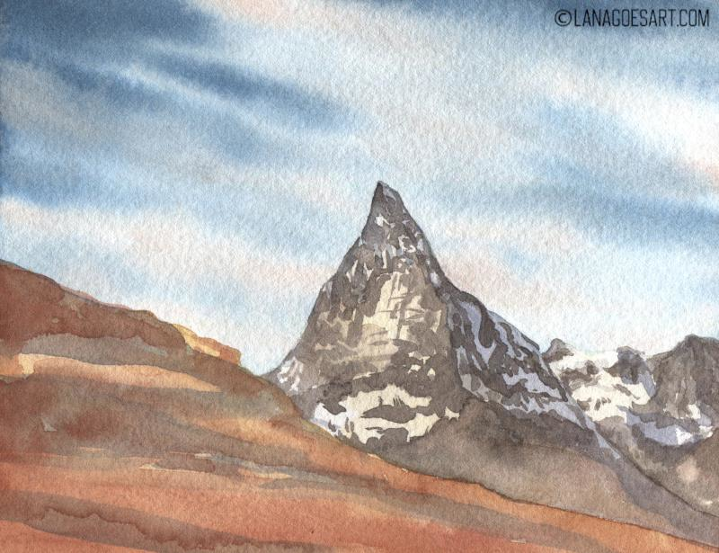
The Reference
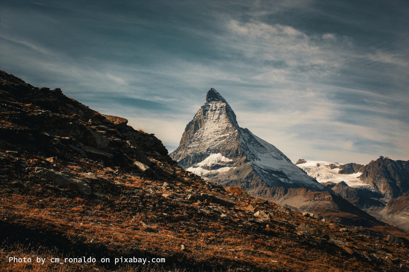
I chose this reference by the user cm_ronaldo on pixabay.com for this example. It doesn’t have as many layers as the example I chose and will be easier to paint during the short time we have on stream. But the basic ideas can be transferred and you’ll see how easy it actually is to paint mountains.
In no time you’ll be ready to paint all the great mountain landscapes you want to paint!
A List of My Supplies
- watercolor paper (I prefer 100% cotton)
- watercolors (I use a simple Schmincke Akademie set)
- watercolor brushes (various sizes)
- pencil and eraser
- white gouache, ink or gel pen
Remember that you always can use whatever you have on hand to paint with me and follow my tutorials. I only use a basic set of colors and explain what you can mix to achieve the desired result. So feel free to join with whatever paints you have available to you!
I also have a post on what you really need to start with watercolors as well as how to choose the perfect paper for you.
Affiliate links to Amazon were used where possible to help support the site and database. I will receive a small commission when these are used for purchases at no extra cost to you. Thank you!
1. Sketch first
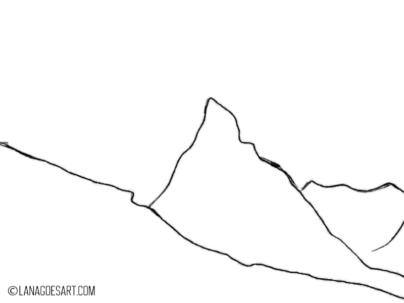
The sketch for this painting is really simple. Don’t worry if your lines are jiggly, it’s all perfect here. Keep your lines light and you’ll be ok! Use the lineart above as a guide for your sketch.
2. Paint the Sky
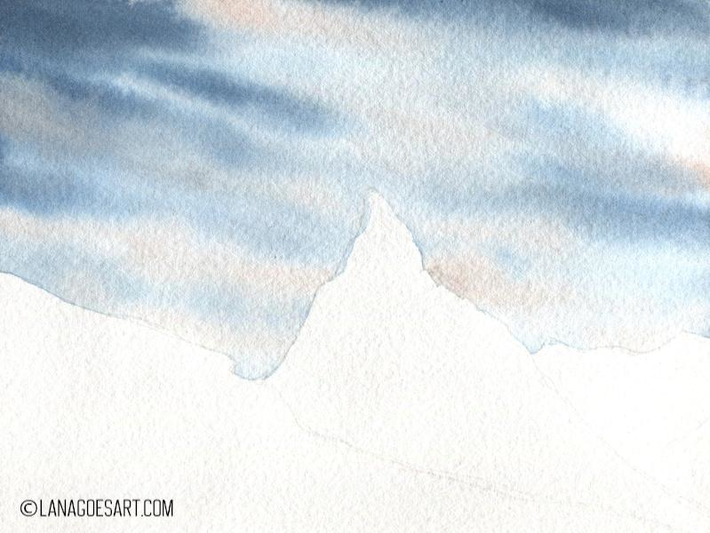
Let’s jump in into the fun part! Prewet the area of the sky only. Do not prewet the whole paper to avoid colors bleeding into the mountain area. This will help to keep the crisp line between sky and mountains.
Mix Phthalo Blue (Cyan) and a little bit of English Red (or burnt Sienna) on you palette. Apply the most intense color in the outer corners and carefully drag lines on an angle through the painting. Lift your brush in the center to keep it lighter. Also avoid the mountain area. Do not cover the full sky, just paint the lines, that can touch at the borders but leave a lot of white in the center. The soft edges from the wet on wet technique will create the illusion of soft clouds.
Mix a tiny bit of English Red (burnt Sienna) on you palette with a lot of water and a hint of Phthalo Blue to a reddish peach, barely visible color and apply it carefully in the bottom white clouds to give them just a tint of peach.
Let the painting dry before you go on, so the colors don’t bleed into each other.
3. Give the Mountains Warmth
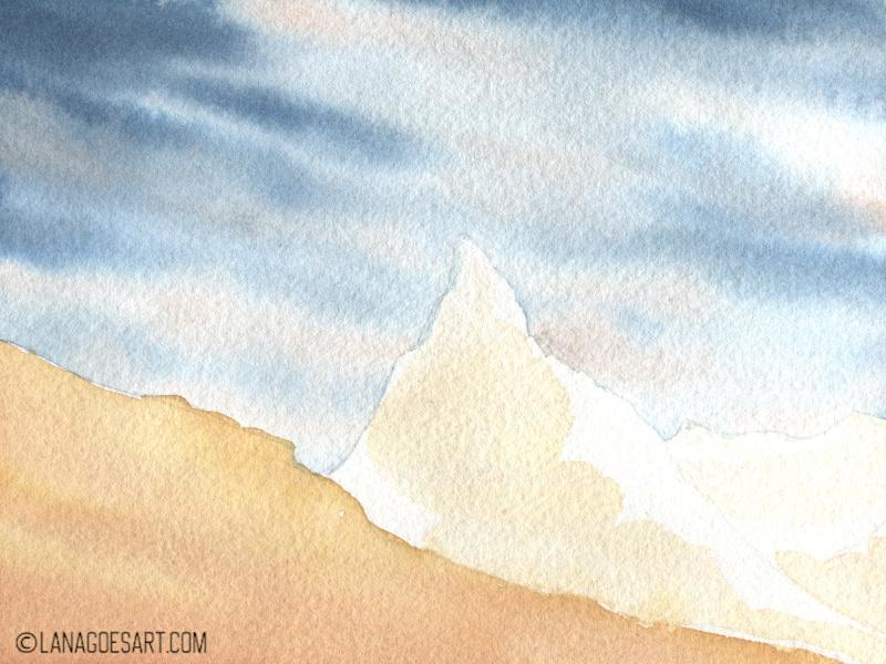
Mix Yellow Ochre and a little bit of English Red (burnt Sienna) on your palette and apply a very watery mix to the center mountain as you can see in the example above. Do not cover the whole mountain and keep some areas white. Apply an even more diluted mix to the mountain in the back.
Mix more Yellow Ochre and English Red on your palette and cover the mountain in the front. Add some English Red in the lower area to enhance that color.
Let this layer dry again before you move on.
4. Paint the Shadows
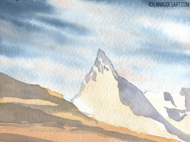
It might be odd to paint the shadows before you paint the details, right? Glazing over the details can move the paint and soften their edges. On the mountains I like to keep those crisp and thus I’m just changing the order. You can always add shadows later on too!
Mix Ultramarine and Burnt Umber to a bluish to neutral grey color and apply the darkest mix on the mountain in the front. Dilute it slightly and paint the shadows on the second and third mountain.
Let the paint dry again completely.
Info: Glazing is a technique where you layer a layer of paint over another, already dried, layer of paint. This helps to adjust values or shift colors into a different hue and is a basic technique in watercolors.
5. Let’s Start with the Details
Sorry if it feels confusing! But believe me, we’ll all get there! This step is where the beauty begins.
Mix more burnt Umber to your grey mix from the previous step. The color needs to be warmer, brownish and about a middle tone. Paint the areas not covered by snow (white). This layer usually dries very fast as there is not much water on the brush and you can darken up some areas rightaway.
Paint the details in lines and a brush that has a good tip.
In the lower area you can add some more English Red or Yellow Ochre for a lighter warm spot in between your dark brown mix.
6. Paint the Central Mountain

Use the same mix of cool deep brown from burnt Umber and Ultramarine to paint the details for the mountain in the center. It helps to use a smaller brush for the details like size 4 which holds a good small tip. That way you can add the details you want. In the bottom right area you can add a little bit of English Red to the mix to warm up the color slightly.
7. Warm Up the Foreground
With English Red you can warm up the foreground by covering the hill in the front almost completely. Be sure to vary the consistency of your paint to achieve a nice variation.
Let the layer dry completely again.
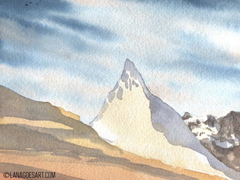
8. Deepen the Shadows
Mix a very intense mix of burnt Umber and Ultramarine and enhance some of the darkest areas of the mountains in the back and center of the painting with it. You can actually do that before the foreground is fully dry. Use then the same mix to give some detail to the foreground. Remember to paint “around” the light stones and leave some areas lighter.
Let this layer dry completely again.
9. Adjust Values

This step is actually what gives the painting the last magic. Use a very intense mix of burnt Umber and Ultramarine again and glaze carefully over the foreground leaving some areas of light. Use the mix for very little intense dark shadows in the middle mountain too.
10. Add Few Highlights
We were so good to preserve white in this tutorial, especially in the mountains for snow. If you lost some of it or you want to enhance some, you can use white gouache.
I used some to enhance the light on some rocks in the foreground. If you like, you can mix in some Yellow Ochre with your gouache to make the highlights look warmer.
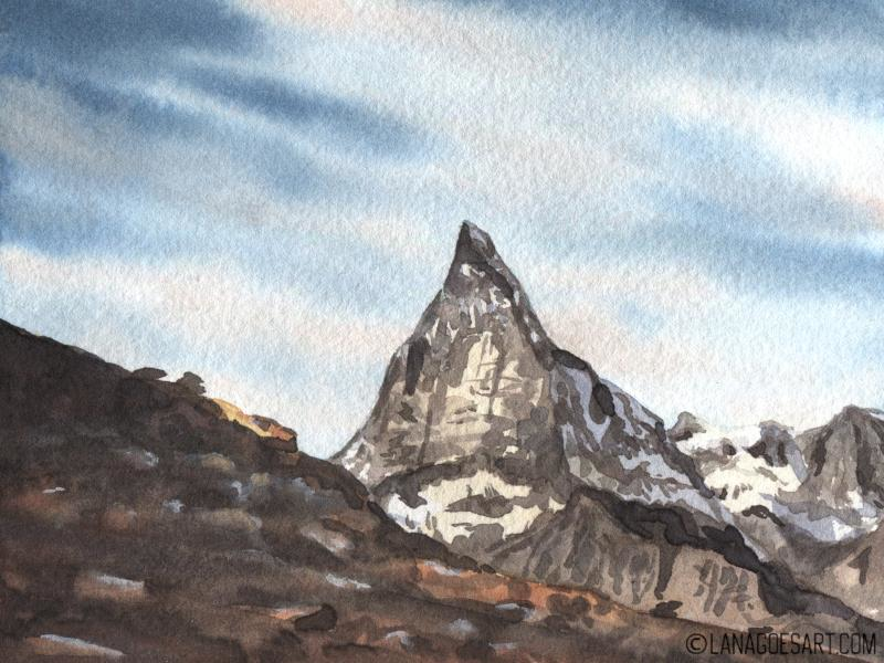
Final Piece

I hope you enjoyed painting with me and are happy with your mountain landscape too. Feel free to share it with me on discord or tag me on Bluesky or Mastodon. I’m always happy to see your pieces and share my nerdiness with you.
If you feel inspired and want to join me in another tutorial, there is one live one on twitch each month and you can also join in the previous ones here on the blog.
And if you want this series of tutorials to go on, you're welcome to tip me with a coffee so this journey can continue. Thank you!
Have a great and creative day!