
Caput Mortuum and Cobalt Blue are a mix, that I love for its granulation and soft grays. And thus I want to share my joy over those wonderful mixes with you in this little color study.
Chapters
- Caput Mortuum - Beautiful Color With A Creepy History
- The Color Study
- The Inspiration
- The Love Of Granulation
- The Benefit
- Want To Do Color Studies Yourself?
- Footnotes
Caput Mortuum - Beautiful Color With A Creepy History
Caput Mortuum is a pigment with a very special history. The name is Latin and means “head of the dead”. There are several stories about what caused this pigment to have such a creepy name. Some connect it to the dried blood on the stump of the head after beheading someone. It’s also possible, that “caput mortuum” was used by alchemists for useless byproducts of their experiments. This is also how allegedly the pigment was discovered in 15th century: through burning Pyrite.1
The result was a reddish-violet powder, an iron oxide.
When buying a color this name today, you will see the pigments PR101 or PR102 used for most. Both are iron oxides. These are in some cases mixed with some black or purple pigment. In my watercolor database you can see the variations between the manufacturers.
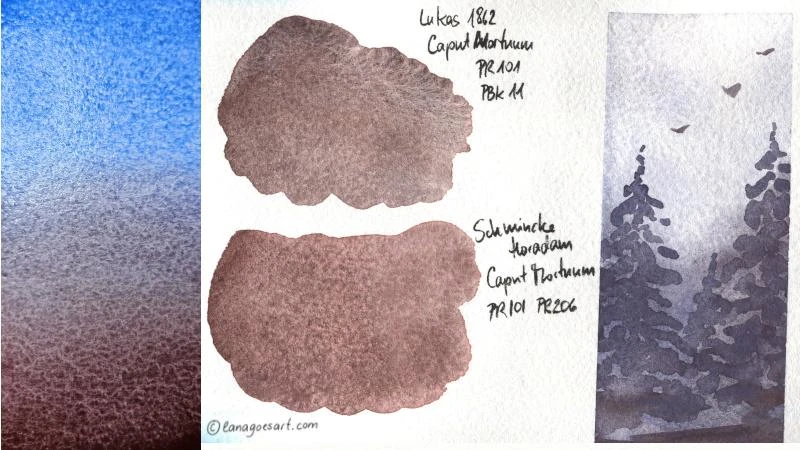
Two swatches of versions of Caput Mortuum that I had on my desk from Lukas and Schmincke. On the left is a gradient, still wet and showing the granulation of both colors nicely, with Cobalt Blue and on the right a first simple sketch using a mix of both.
The Color Study
For this little color study I chose to use the Caput Mortuum version by Lukas 1862. In my palette it’s a color that is used regularly. Especially in the combination with Cobalt Blue (PB28).
The mix of both pigments will give you the softest most beautiful purple-greys, which I love to use in the background of my pet portraits. In addition both pigments are heavily granulating among all manufacturers. Lukas seems to have ground the pigments less fine, which enhances the granulation effect. Of course it’s further enhanced by the paper choice I made, it’s rough.
First I mixed both of my chosen colors to see which mixes I might receive. From the bright soft Cobalt Blue to the rusty violet-brown of Caput Mortuum everything is possible. Deep blues, similar to Indanthrone Blue2 but granulating to deep grays, almost black.
For me it’s always helpful to see, which variations, hues, shades and possibilities I have, before I start with a painting. And often those hues is what inspires me to paint something particular.
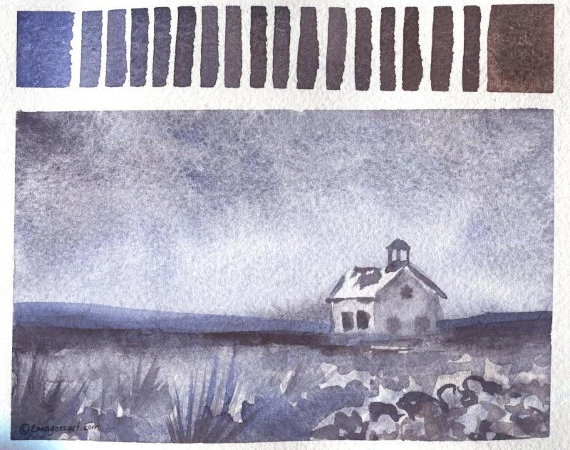
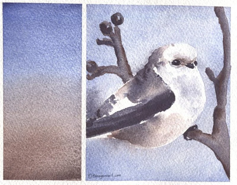
Gradual mixing of Cobald Blue and Caput Mortuum with another simple landscape underneath showing how both colors play with each other with a wide range of values.
The Inspiration
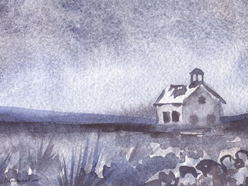
The grays remind me of the grey, cloudy February skies, which we all (at least in this region) have outside our windows right now. The inspirations I have for my paintings often comes from life around me, so it’s just what I painted.
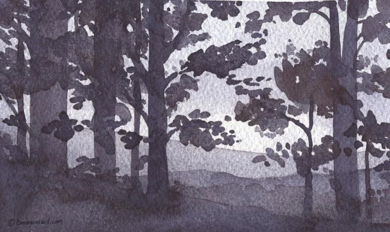
Small landscapes to test the mixes and their possibilities. I started with soft applications for the sky and worked layer by layer to the front.
Another simple landscape using Caput Mortuum and Cobalt Blue.
The Love Of Granulation
In the first layers granulation already showed itself more than clearly. With more water on my brush or paper I could even enhance the effect. And my simple little heart felt the most joy doing so. I love it to see, how pigments show their properties and ultimately is what gives a painting its character.
That’s why I of course didn’t stop at one painting. I kept exploring the mixes of these two pigments further on stream and painted a cat. Dee Dee’s gray fur is just perfect for this color study. In addition I added green gold (PY129) for the eyes. Because how can I paint those beautiful kitty eyes without adding their glow? Right?
The second cat of the family, Dexter, was painted too. Now the set is complete.
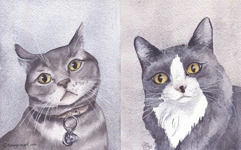
Dexter and Dee Dee as a set of paintings with green eyes.
The Benefit
Of course I don’t do color studies just for the fun of it and because they’re so pretty to share with you. It’s an important moment for me to get to know my material, my supplies better as well as the colors/pigments and how well they play together with others.
Especially when doing commissions and capture pets on paper, I want to be able to consciously and confidently be able to choose colors to work with and avoid surprises. When I paint, I know how I can achieve a certain effect and will feel more secure during the painting process. Even when the paintings I’ve showed here are not perfect and simple in comparison, they’re valuable for me and I’ve gained another piece of knowledge, that I can use in the future.
The gradient between the two chosen colors with another little sketch.
Want To Do Color Studies Yourself?
If you want to paint along and create similar mixes, you can follow the winter owl tutorial where I use English Red, which also is made from pigment PR101. The mixes are similar, while slightly more red, and the color granulates just as beautiful. With either Caput Mortuum or English Red you can achieve similar results as I did with today’s tests. If you want also to substitute with a granulating blue from one of the sets you most likely have, then Ultramarine (PB29) is your friend in this case.
Of course you can also use other colors, maybe those that got little use from you so far, and explore their properties and paint, whatever is on your mind. That’s a great way to get to know your supplies.
Footnotes
Indanthrone blue is the pigment PB60 and not granulating in itself, but a beautiful transparent warm blue. With this mix we can achieve a similar hue but with a beautiful deep granulation.