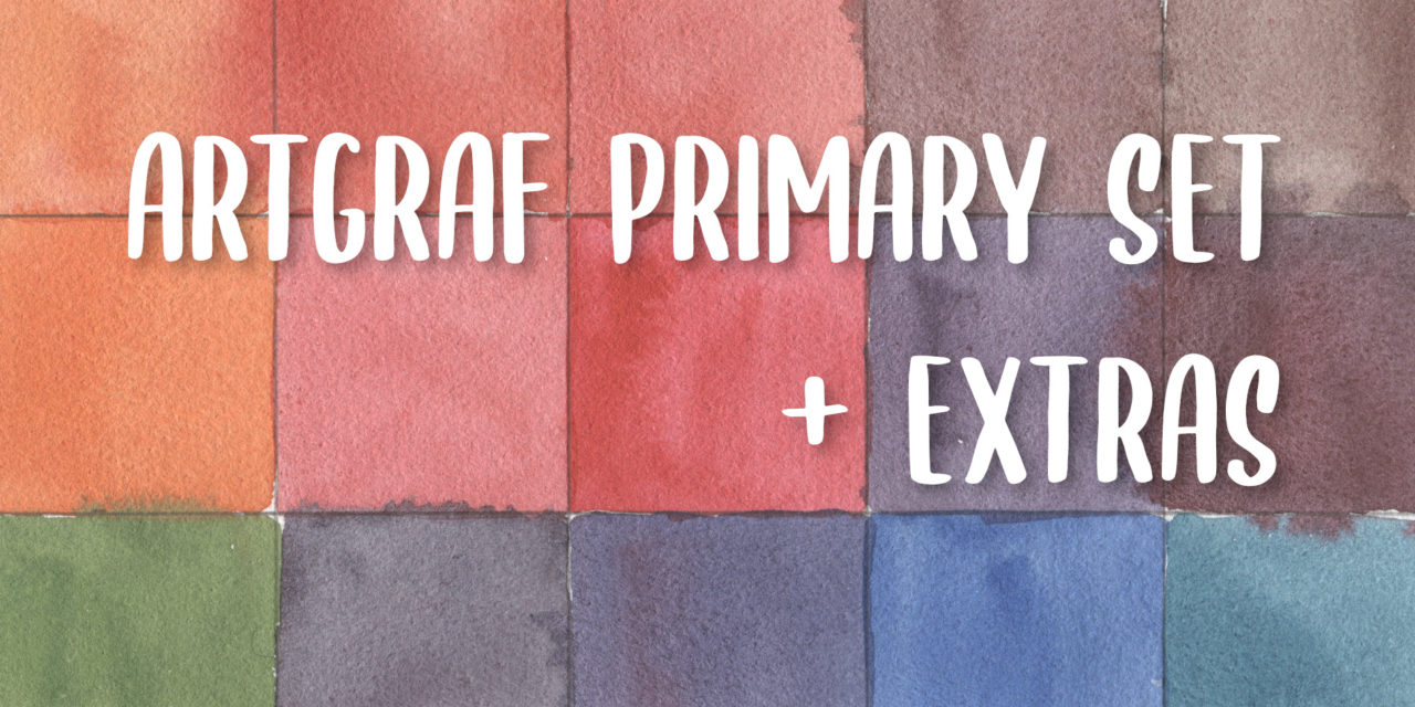
Die Diskussion um Primärfarben kann eine geladene sein. Ist es nun Rot, Blau, Gelb oder Gelb, Magenta, Cyan? Offenbar hat diese auch Viarco, den Hersteller der ArtGraf Tailor Shapes beschäftigt, sodass sich das Set der Primärfarben in der Zusammenstellung geändert hat.
Hatte das alte Set die Farben “Primärgelb/Gelb”, “Primärblau/Blau” und “Primärrot/Rot”, änderte sich dies in den neuen Sets, sodass “Magenta” statt des “Primärrots” einen Platz in den Sets fand. Noch sind die Beschreibungen in den Shops nicht aktuell, sodass als ich mir das Primärfarbenset + Magenta und Grün kaufte, ich mich plötzlich im Besitz von zwei Magentas fand. Das Rot bestellte ich nach, damit ich immernoch eine sorgfältige Review machen kann und natürlich die Änderungen in den Sets zeigen kann.

Dieser Beitrag ist wie immer nicht gesponsort und ich habe alle Farben selbst von meinem Geld gekauft. Daher kann ich sorglos lästern. Zu lästern gibt es allerdings nicht viel.
Viarco ist ein Unternehmen, dass sich auf Zeichenutensilien mit Graphit und Kohle spezialisiert hat, diese sind vermutlich auch eine der Grundlagend er Tailor Shapes, obwohl es nicht angegeben wird. Die Pigmentinformationen habe ich vom Unternehmen selbst sowie die Lichtechtheitsbewertungen. Natürlich teste ich die Farben selbst nochmal, um zu sehen, wie diese sich bei Lichteinstrahlung verhalten werden. Die Swatches sind bereits in der Aquarell- und Lichtechtheitsdatenbank sunandcolors.com vorhanden. Die Ergebnisse des Lichtechtheitstests werden demnächst nachgeliefert.
Nun aber zur eigentlichen Review: Im Primärfarbenset befindet sich: Gelb, Blau, Magenta. Die Farben Rot und Grün habe ich extra gekauft. Zwecks der Einfachheit werden diese fünf Farben in einem Rutsch getestet und reviewt.
Um zu sehen, inwieweit die Farben sich mischen lassen, erstellte ich einen sogenannten Mixing Chart, in dem jede Farbe mit jeder anderen gemischt wird.
Da frühere Kritiken die Zusammenstellung der Primärfarben, die Rot enthielten, bemängelten, ist Magenta eine gute Abwechslung. Um zu sehen, wie sich die Sets verändert haben, habe ich einen Farbkreis erstellt.
Man kann deutlich erkennen, dass im alten Set mit Rot die Mischung zu Lila nur semi-gut funktionierte und das Lila etwas schmutzig wirkte. Mit Magenta hat sich dies deutlich verbessert, auch wenn es noch etwas besser mit einem noch kälteren Rotton funktionieren würde, etwa dem Pigment PV19. Mit den neuen Sets ist aber die Mischbarkeit gut gegeben, man hat eine große Vielfalt der Farben, die man sich mischen kann. Auch Brauntöne und Schwarz gelangen mir ohne Mühe – insofern man die Farbtheorie beherrscht natürlich oder viel rumprobiert.
Selbstverständlich testete ich die Farben auch auf Transparenz, Lifting und die Lasierfähigkeit, die ihr alle im Swatch sehen könnt.
Im Video sieht man zusätzlich die Farben in Aktion, wie gut sie fließen und hoffentlich, dass sie mir echt Spaß bereitet haben.
Um ehrlich zu sein, bleiben die Erdfarben jedoch mein persönlicher Favorit, weil die Farbzusammenstellung viel besser zu meinem Stil und meinen Bedürfnissen passt. Für die Primärfarben sehe ich einen Zweck zum Erlernen der Farbtheorie, einfaches Skizzieren und das “Grundset”, das auf dem Tisch bleiben kann, um mal schnell Farbe auf’s Papier zu bringen.
Gerne würde ich die Korkpaletten auch für die Einzelfarben sehen, damit ich mir den Graphitblock auf den Tisch legen kann, um damit mit dem Pinsel schnell und einfach skizzieren zu können. Das und PV19 wären meine einzigen Wünsche zur Verbesserung der Sets. Insgesamt ist dies jedoch Meckern auf hohem Niveau und ich sehe mich dieses Set auch in Zukunft nutzen.
Habt ihr Erfahrungen mit den Sets? Teilt diese mit mir/uns in den Kommentaren! Ich bin sehr gespannt, wie ihr sie findet.
Habt einen entspannten und kreativen Tag!
Lana
The discussion what the true primaries are can be a loaded one. Is it red, blue and yellow or yellow, magenta and cyan? These are the questions that Viarco clearly asked themselves tooas they’ve changed the colours in this set recently.

The earlier Primary set had the colours “primary yellow/yellow”, “primary blue/blue” and “primary red/ red”, while the newer sets have a “magenta” instead of the “primary red”. In the shop listings it often still says that they contain red, that’s why I ended up having two magentas when I ordered a magenta and green extra to properly test “all the colours”. After realizing this, I ordered a red to have all the colours complete. This helps me to show you how these sets differ and what was improved.
As always I was not sponsored by the company and have purchased and paid all the colours myself. This makes me free and I can rant as I like – although there is not much to rant about.
Viarco is a company, that specializes in drawing supplies made from charcoal and graphite, which probably are the base for the Tailor Shapes although it’s not mentioned. The pigment informations I got are from the company itself, whom I had very nice and pleasant chats with, same goes for the lightfastness ratings. Of course I do test the lightfastness myself in an independent test too and the initial swatches are already added to the watercolour and lightfastness database sunandcolors.com. As soon as the lightfastness test results are ready, I will add those too.
Let’s start with the review though: The primary set contains Yellow, Blue and Magenta, as mentioned I did purchase the colours Red and Green extra. For my comfort I did test all these colours in one go and will present them to you.
To see how the colours mix amongst each other I created a mixing chart where you can see the possible mixes.

As earlier critiques mentioned the red and the lack of possibility to mix a proper purple, I created two colour wheels for the old and new sets. In the old one it’s apparent, that the purple is not as vibrant as in the one with the magenta. And although I wish the Magenta was made from a even cooler red as PV19, this one already shows an improvement. Mixing all the colours I needed was easy with this set, even different browns and black, that I created from red and green. Of course you need some basic knowledge of colour theory and mixing experience to do that.
To learn and practice this set is a good start though.
Of course I tested for transparency, ligfting, glazing and dispersion too, which you can see in the swatches.

In the video you can also see how the colours behave in action and during actual use. Painting with them was not a burden and I enjoyed them a lot. They were easy to rewet and I loved them on toned paper especially.
To be honest, after trying all the sets, the Earth Colours stay my personal favourite because they fit my style and needs best. To learn and practice I see use in the (new) primary set as they can be a go to palette on the desk for quick sketches.
I would love to have the cork casings for singles too, which come in a plastic packaging right now. It would allow me to rearrage the sets as I would love to have the graphite block on my desk permanently to use it for sketching. This and the wish to have a PV19 magenta are the only critiques I can offer for this set… and also if you like transparency: these can be opaque in the mass tone!
This is not much of a critique when it comes to the sets as they work very well and I have no issues with the paints themselves.
Do you have experiences with these colours? I would love to read them and am curious how you liked them.
Have a relaxing and creative day!
Lana


Neueste Kommentare