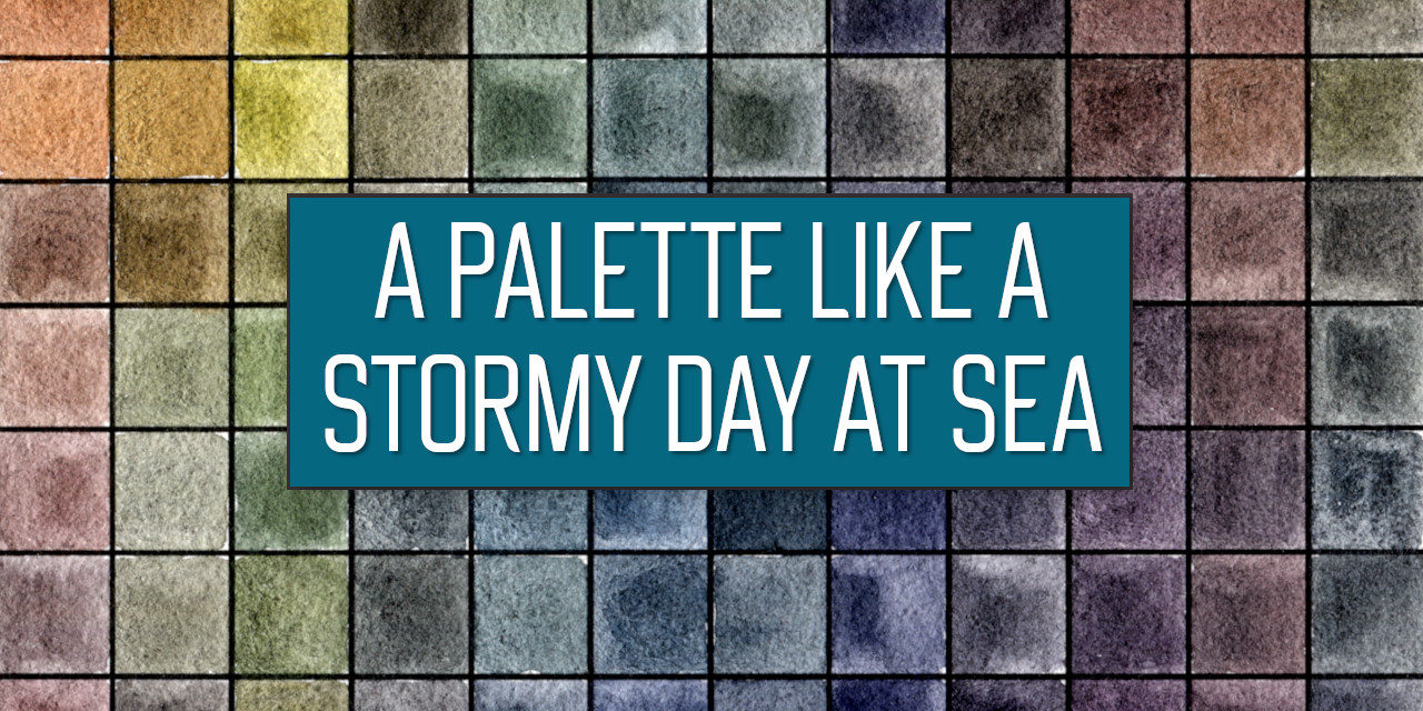


Ein stürmischer Tag an der See, die Wellen wild und grau und bereit alles zu verschlingen. Daran erinnert mich diese Graphitint Palette mit 12 Farben von Derwent (Affiliate Link). Graphitint das ist wasserlösliches Graphit mit etwas Pigment versetzt und wie Aquarell in Näpfchen gefüllt. Graphitint gibt es aber auch als Aquarellstifte.
Die gedeckten ruhigen Farben hatten mich sehr gereizt und ich war echt froh, als ich die Palette vor einigen Monaten bereits gekauft hatte. Ich swatchte, probierte aus, malte. Im Video gehe ich auf alle Tests ein, hier gibt es einen Überblick über die wichtigsten Eigenschaften und Scans der ganzen schönen Swatches.
Eigenschaften
Granulation: Durch das beigemischte Graphit granulieren die Farben ganz hervorragend. Es ist in allen Farben sichtbar und stellt einen wirklich zauberhaften Effekt her. Durch das Graphit erhalten die Farben auch einen Schein, fast schon Glanz, nach dem Trocknen.
Transparenz: Beim Swatchen fällt auf, dass die meisten der Farben sich auf dem Schwarz deutlich abzeichnen. Sie sind daher im Vollton eher deckend, etwas verdünnt nimmt natürlich auch die Transparenz wieder zu.
Lasur: Die Lasur ist mit den Farben möglich, jedoch nur mit verdünnter Farbe, weil sonst die darunterliegende Farbe nicht sichtbar ist. Zudem kann bei einem starken Reiben und viel Wasser auch die darunterliegende Farbschicht gestört werden.
Lifting/Staining: Das Abnehmen der Farbe mithilfe eines feuchten Pinsels ist sehr gut möglich. Besonders das Graphit kann damit gut aufgenommen werden, einige der Farben des Sets sind jedoch färbend und es bleiben Spuren auf dem Papier zurück.
Radieren: Das Radieren ist ebenfalls möglich. Funktionierte im Test jedoch schlechter als das Lifting und hinterließ mehr Spuren. Zudem ist dies eher nachteiliger für das Papier und kann das Papier beschädigen.
Dispersion: Die Farben fließen gut in Wasser. Die Bewerbung erhöht auch den Granulationseffekt. Besonders die Pigmente fließen weit, wenn dies möglich ist.
Mischen: Grundsätzlich können die Farben problemlos untereinander und auch mit anderen Aquarellfarben gemischt werden. Für die Review habe ich auch einen Mixing Chart der Graphitint Palette erstellt. Die Farben sind alle gedeckt und entsprechen übrigens nicht ganz den auf der Verpackung dargestellten Töne. Sie sind in einigen Fällen dunkler bzw. weniger farbenfroh. Da viele Blautöne in der Palette sind und diese gedeckten Farben generell nicht viel Varianz erlauben, sieht auch der Mixing Chart entsprechend aus. Die Mischungen sind gedeckt und spiegeln die Stimmung dieser Palette wieder. Es ist jedoch möglich eine „Primärfarbentriade“ zu erstellen, die auch das Mischen von Sekundärfarben erlauben würde. Diese besteht in meinem Beispiel aus Autumn Brown, Meadow und Ocean Blue. Die Mischungen ähneln jedoch anderen in der Palette bereits vorhandenen Farbtönen.
Fazit
Wie immer muss jeder selbst entscheiden, welche Produkte zum eigenen Stil passen. Ich bin immer versucht, wenn die Paletten etwas anders wirken, neu und aufregend. Besonders wasserlösliches Graphit finde ich spannend, daher war dieses Graphitint Set von Derwent für mich auch eine ganz spannende Angelegenheit. Die Farben verhalten sich auch so, wie ich das erwartet habe. Allerdings hat mich diese Palette irgendwie gestresst. Ich denke, dass der Grund dafür die sehr blaulastige Farbzusammenstellung gewesen ist. Mit anderen ähnlichen Produkten in Naturtönen hatte ich bessere Erfahrungen gemacht. Auch hatte ich Probleme Licht und Schatten so darzustellen, wie es mir am besten gefällt. Auch wenn die Farben eher gedeckt und dunkel sind, erreicht man nur ganz schwer ein Schwarz oder ähnlich dunkle Farben. Am besten ging das mit der Farbe Aubergine. Dies erschwerte mir aber den Prozess etwas und ich hatte nicht so viel Spaß damit, wie ich hätte haben können. Ich glaube, dass man, um dieses Problem zu lösen, andere Produkte, vielleicht sogar die Aquarellstifte von Graphitint (Affiliate Link) hinzunehmen muss, um eben diese frustrierenden Kleinigkeiten zu lösen.
Auf der Seite von Derwent sah ich auch, dass viele sich beschwerten, weil sie andere Farben erwartet haben, heller und fröhlicher: Dies ist ganz bewusst eine Palette mit gedeckten Farben und es wird nicht gelingen helle, frohe Farbtöne zu mischen. Bitte sehr euch die Swatches in den Fotos an. Damit auch eure mögliche Kaufentscheidung fundiert ist und ihr keinen Frust habt.
Am Ende bleibe ich zurück mit gemischten Gefühlen. Noch immer sehe ich mir die Palette gerne an, finde die Farben und Granulierung unheimlich schön. Ich denke, dass ich mich nochmal an diese machen werde, und dann einen Weg finde, doch meinem Wunsch diese Palette zu lieben, gerecht zu werden.
Im Video könnt ihr übrigens den Malprozess mit den Farben nochmal genau sehen, die Palette und natürlich auch den Wasserpinsel. (Den ich übrigens zu klein finde.)
Habt einen wundervollen und kreativen Tag!
Lana
A stormy dat at sea, the waves are wild and grey and ready to swallow everything. This is what the Derwent Graphitint 12 pan palette (affiliate link) reminds me of. Graphitint are watersoluble graphites mixed with some pigments and filled into pans like watercolours. The Graphitints are available as watersoluble pencils also.
The calm, muted colours have called to me and I was so happy to have purchased the palette a few months ago. After I swatched, tested and painted. In the video I show all the tests as well as the painting process. Here you can read a detailed overview over all the tests and their results as well as take a look at the scanned swatches.
Properties
Granulation: The added graphite does granulate wonderfully in the paints. The granulation is well visible in all of the colours and creates a gorgeous effect. The colours do get a shine though caused by the added graphite, which is well visible after drying.
Transparency: After swatching it’s well visible, that most of the colours in the set show on the black line. In mass tone they are rather opaque, but of course the transparency is increased once they’re watered down a bit during the painting process.
Glazing: Glazing is possible, but only when the colours are thinned down a little, otherwise the paint underneath will not be completely visible due to the opaqueness. In addition rubbing can disturb the layers beneath and lift the colours a little.
Lifting/Staining: Lifting is possible pretty well. Especially the graphite can be removed completely. The mixed in pigments do stain the paper in some of the colours though, so that it will be difficult to have a completely white paper afterwards.
Erasing: Erasing is possible as well. During the test it worked not as well as lifting though and left more pigment on the paper. Additionally the eraser can be rough on watercolour paper and damage it’s surface.
Disperson: The paints flow nicely in water especially the pigments, while the graphite created the nice granulation. The free movement in water increased the granulation effect.
Mixing: The paints can be mixed with eath other as well as other watercolours. For the review I created a mixing chart though to show the colour range and some possible mixes. The colours are all muted, which btw does not show as well on the packaging, where the swatches appear more light and bright. In some cases the colours are more muted and darker than the packaging suggests. Many blue tones are included in the palette, which allow for little variation during the mixing process. The mixes are all muted as well and fit to the mood of the palette. It is possible to create a „primary triad“, which would allow mixing secondary colours. In my example the triad would be Autumn Brown, Meadow and Ocean Blue. The created mixes look very similar to colours that are already in the palette though.
Conclusion
As always I can’t take the decision from you whether to purchase a set or not. They have to fit your style. I’m always tempted by palettes that are unusual, new and exciting. Especially watersoluble graphite excited me and that’s why I was tempted by the Graphitint set. The colours behave as I would have expected. But somehow I did not become friends with this palette. I do love it, but also can’t make it work for me. The reason is probably the amount of blue tones that are given and the little colour variations. Other similar products that provided more natural tones did fit my style better and I enjoyed them much more. I also had problems to create lights and darks as I wanted to. Although the colours are dark and muted it was difficult to create real darks. Only Aubergine was able to do so kind of, which is a dark purple. To solve this problem, I probably would have to add other supplies to make up for this. Maybe even the watersoluble Graphitint pencils by Derwent (affiliate link). I’m not sure and I have not tried yet.
On the site of Derwent I have seen many complain about the difference between the swatches and the actual colours. The swatches look lighter and more saturated than the colours actually are. That’s why I want you to know, that this is indeed a palette with muted colours only as the swatches that I’ve created show. Please take a look and decide then if this is a palette you want.
In the end I am left with mixed feelings about this palette. I still do enjoy the colours and how they look. The granulation is gorgeous. And I think I will try working with it again to make them finally work for me.
In the video you can see the whole painting process and of course more about the case and water brush. (Which is btw a bit too small for me.)
Have a wonderful and creative day!
Lana


Neueste Kommentare